0. Visualising Geospatial Data
As mentioned in the introduction, the main purpose of the ltaer package is to improve accessibility of Singapore’s transportation data to the wider public. Visualisations are a crucial part of this because it communicates key observations and trends from the data in an intuitive and comprehensible manner.
Visualising geospatial data is generally more challenging that running visualisations on the ggplot2 package, primarily because there are more things one has to deal with. The good thing is that there are many R packages that greatly simplify the amount we need to learn and do to create effective visualisations.
Hence, this vignette aims to provide some suggestions and tips in visualising the data obtained from the various APIs. I begin first with introducing exploreSGMap and plotSGMap in this package, which enables you to plot your data with minimal coding. Then, I will delve deeper into the underlying packages for each function, which are leaflet and ggmap respectively, to show you how what is possible with a bit more coding.
1. Using exploreSGMap
exploreSGMap is a convenient leaflet wrapper which allows users to quickly plot geospatial data on an interactive map for data exploration. A picture speaks a thousand words, so…
library(ltaer)
exploreSGMap(bus_stops, popup = 'Description', cluster = FALSE, colour = 'green', alpha = 1, size = 1)
#> Assuming "Longitude" and "Latitude" are longitude and latitude, respectively
The function above plots all the bus stops in Singapore on an interactive map, with each green-coloured dot representing a single bus stop. Clicking on the dot (which is difficult given its small size) will produce a pop up with the bus stop description as provided by LTA.
The key contributions here are twofold: users do not need any knowledge of leaflet, and ggplot2 syntax is used here for familiarity (alpha and size are not leaflet arguments). The motivation here is to enable users to have a quick look at the data from a spatial perspective, and thus to quickly get to grips with the data they have received from the APIs.
Here is an explanation of the various arguments in the function:
-
dataframe: The dataframe you want to plot on the Singapore map. It must contain one column for latitude, named either as ‘lat’ or ‘latitude’, and one column for longitude, named either as ‘lng’ or ‘longitude’ - neither are case-sensitive. -
popup: What appears when you click on each point on the Singapore map. It must be a character string and name another column in thedataframethat you want to display in the pop up. -
cluster: Whether you want to display each point individually or cluster them automatically based on regions. By default, this is set toFALSE. -
colour: The colour of each point being plotted. You can either state some simple colours directly (like ‘red’ or ‘blue’) or use a hex code - the default here is ‘red’. -
alpha: How opaque each point is. You can set it to 1 for fully opaque, and 0 for fully transparent - the default here is 0.5. -
size: How large each point is. This is set to 5 by default, although for more cluttered maps you may want a smaller value like 1.
One important caveat: exploreSGMap is intended primarily as a visualisation tool for data exploration, rather than for building a final product. As such, the function only provides a few parameters for users to play with, rather than the full functionality offered by leaflet. I provide one example of how leaflet can be leveraged to produce excellent visualisations for a final product below.
2. Using plotSGMap
plotSGMap is an easy-to-use ggmap wrapper to enable basic visualisations of the spatial data retrieved from the LTA APIs. Here is an example below:
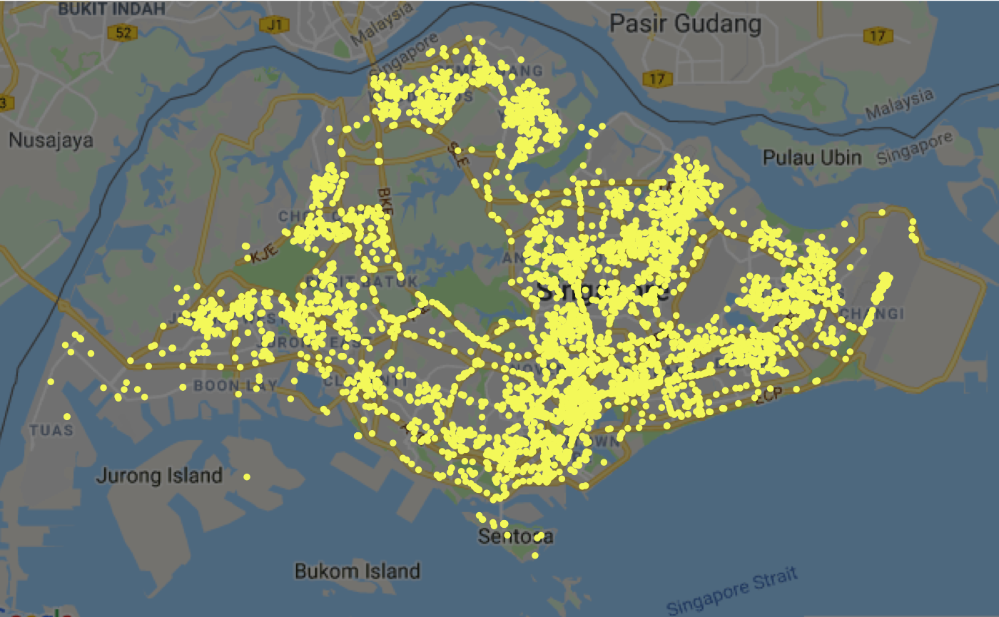
plotSGMap(taxi_avail, colour = '#f5f66b', alpha = 1, size = 1, darken = 0.5)
The function above plots all the available taxis in Singapore (on 11 December 2018 at 11.10pm) on a static map, with each yellow-coloured dot representing a single taxi. Unlike exploreSGMap, there is no interactivity in this plot so you cannot click on the map or zoom in further.
Using the plotSGMap provides a useful shortcut by providing users directly with a basemap of Singapore - the map data is available in the package as sg_map. As such, you do not need to use the get_googlemap function to get the map from the Google Maps API, nor do you need a Google API key to set up this simple visualisation.
As above, here is an explanation of the various arguments in the function:
-
dataframe: The dataframe you want to plot on the Singapore map. It must contain one column for latitude, named either as ‘lat’ or ‘latitude’, and one column for longitude, named either as ‘lng’ or ‘longitude’ - neither are case-sensitive. -
colour: The colour of each point being plotted. You can either state some simple colours directly (like ‘red’ or ‘blue’) or use a hex code - the default here is ‘red’. -
alpha: How opaque each point is. You can set it to 1 for fully opaque, and 0 for fully transparent - the default here is 0.5. -
size: How large each point is. This is set to 5 by default, although for more cluttered maps you may want a smaller value like 1. -
darken: How dark the basemap is. This is set to 0 by default, and ranges from 0 (no darkening) to 1 (full darkening).
The same caveat applies as with exploreSGMap: this function is intended primarily as a visualisation tool for data exploration. See below for an example of how to use ggmap to plot something with more details that can be used as data products.
3. Creating interactive spatial visualisations
Leaflet is one of the most popular tools for building interactive maps, and for good reason: you can create beautiful and informative maps that are interactive with minimal code and fuss. It has been used by various organisations such as The New York Times, FourSquare, and Github. leaflet is the package within R that enables you to create, design, and integrate Leaflet maps using just a few lines of code.
Since exploreSGMap uses leaflet functions within its code, your RStudio will automatically install leaflet into your RStudio whenever you load ltaer. As such, you do not have to worry about installing more packages.
I provide one working example below, using the same bus stops data in the package.
library(leaflet)
library(dplyr)
bus_stops %>%
  leaflet() %>%
  addProviderTiles('CartoDB.DarkMatterNoLabels') %>%
  setView(lat = 1.3521, lng = 103.8298, zoom = 11) %>%
  addCircleMarkers(radius = 1, weight = 1, opacity = 0.7, popup = ~Description, color = "yellow")
I will not delve into a leaflet tutorial here - there are many websites which already do this - but the motivation here is to give you a better idea of what can be achieved by visualising LTA data on leaflet. You will notice that some of the syntax is different (opacity vs alpha, for example), but they are all quite intuitive and easy to pick up as long as you have some experience with ggplot2.
4. Creating static spatial visualisations
One drawback of leaflet, and interactive visualisations in general, is that it can only be embedded in HTML or Markdown documents. This is fine for people who are looking to publish their visualisations online and have the necessary know-how, but what if you wanted to display this in a Word document (as part of a report) or some PowerPoint slides? It would be self-defeating to create an interactive visualisation but having to display it as a mere screenshot.
A more straightforward method here would just be to create a static spatial visualisations using ggmap, as demonstrated earlier using the plotSGMap function that serves as a wrapper for the ggmap package. Similarly, ggmap is automatically installed into your RStudio whenever you load ltaer.
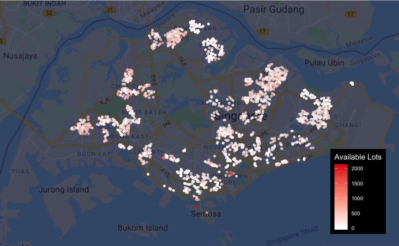
I provide one example of how ggmap can be used to visualise the data from the Carpark Availability API below.
library(ggmap)
ggmap(sg_map, darken=c('0.70', '#030d2f')) + geom_point(data = carpark_avail, aes(x = lng, y = lat, colour = AvailableLots), size = 1, alpha = 0.7) + xlab('') + ylab('') + labs(colour = 'Available Lots') +
  scale_colour_gradient(low = '#FFFFFF', high = '#df2222') +
  theme(axis.line = ggplot2::element_blank(),
        axis.text = ggplot2::element_blank(),
        axis.ticks = ggplot2::element_blank(),
        plot.margin = ggplot2::margin(0, 0, -1, -1, 'cm'),
        legend.position = c(0.9, 0.25),
        legend.title = element_text(colour = 'white', size = 10),
        legend.text = element_text(colour = 'white', size = 7),
        legend.background = element_rect(fill = 'black', size = 0))
As with leaflet, there are many excellent tutorials and resources online that can teach you how to use ggmap to produce great spatial visualisations. Since ggmap uses the same grammar as ggplot2, it is fairly easy to pick it up if you have some understanding of ggplot2, so there is no reason not to step beyond the simple interface provided by plotSGMap and to dive into ggmap yourself.
5. Putting multiple datasets together
Spatial visualisation is interesting because it links location information (coordinates) to some interesting data about that location (income, traffic, age, etc), and through that we can gain some insights about our neighbourhood and our city. While using the data from the LTA APIs directly can already be pretty good, why not go a step further to link a few datasets together?
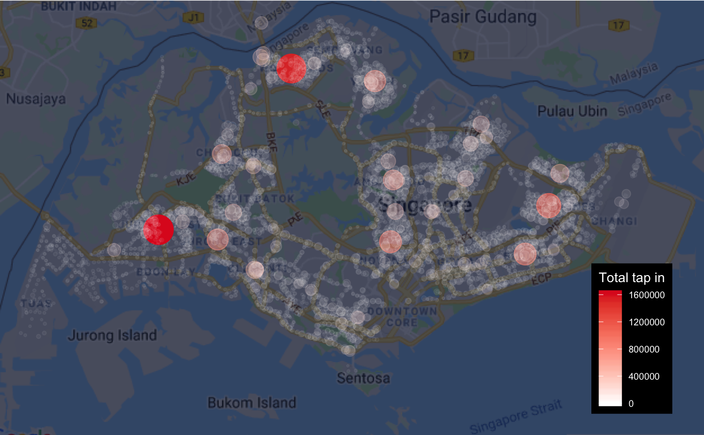
In the example below, I join the bus stop passenger volume data for October 2018 (weekdays only) with bus stops data, and thus produce a dataset which contains location and volume data for each bus stop in Singapore. This is also available in this package as bus_ridership_cleaned. Then, we can visualise this on a static map to see how which bus stops have the highest number of people tapping in.
ggmap(sg_map, darken=c('0.70', '#030d2f')) +
  geom_point(data = bus_ridership_cleaned, aes(x = Longitude, y = Latitude, size = Total_in, color = Total_in, alpha = Total_in)) +
  xlab('') + ylab('') + labs(colour = 'Total tap in') +
  scale_size(range = c(0.5, 10)) +
  scale_alpha_continuous(range = c(0.05, 1)) +
  scale_colour_gradient(low = '#FFFFFF', high = '#df2222') +
  guides(alpha = FALSE, size = FALSE) +
  theme(axis.line = ggplot2::element_blank(),
        axis.text = ggplot2::element_blank(),
        axis.ticks = ggplot2::element_blank(),
        plot.margin = ggplot2::margin(0, 0, -1, -1, 'cm'),
        legend.position = c(0.9, 0.25),
        legend.title = element_text(colour = 'white', size = 10),
        legend.text = element_text(colour = 'white', size = 7),
        legend.background = element_rect(fill = 'black', size = 0))
Unsurprisingly, the largest volume of tap ins are at the bus interchanges located in large residential neighbourhoods, where most people are getting onto buses for the final leg of their commute home. Of course, this data can also be visualised in many other ways, and this example is meant to show you how the data can be joined together to gleam even more insights.
5. Next Steps
Visualising spatial data is more challenging because you have to work with more moving parts (basemap, coordinates, spatial objects). Yet, it is also incredibly rewarding when you produce a good spatial visualisation that communicates your message effectively and looks great. Try both ggmap and leaflet out and see how it goes for you. If you want to move beyond plotting points, and into plotting lines and areas (called polylines and polygons in R), then you should have a look at the sf and sp package which rely on the same dataframe structure to handle spatial data. Thanks to R’s wonderful open-source community, there are plenty of packages out there which will most likely cater to your needs, so do have a look online first before trying to do it yourself manually.
All the best with your visualisations!