Photo by Daniel Adams.
The City's Bikes
Introduction
This was my submission for the final project in my course QMSS 5052 Practicum in Large-Scale Data Analysis. Our task was to work on a large dataset and produce actionable insights for a hypothetical client. For my project, I chose to work with Citi Bike trip data and to predict trip numbers from hypothetical Citi Bike stations. Here is the preview of the final product:
Part 1: Machine Learning
The first part of this project was developing a machine learning model to predict the number of trips that a hypothetical Citi Bike station would generate in 2018, assuming it was built in December 2017. This would be relevant for both policymakers and bicycle operators in deciding where to expand Citi Bike docking stations in New York City.
I relied on 7 different datasets, gathering data from from Citi Bike, MTA, DarkSky, American Community Survey, US Census Bureau, and NYC Open Data. Using these, I generated 32 features for the model, such as the number of Citi Bike stations within 2000m, average precipitation amount, median income of census tract. RStudio had issues with the large datasets, since all the data is held in memory, so I processed and stored all the data in a local MySQL server.
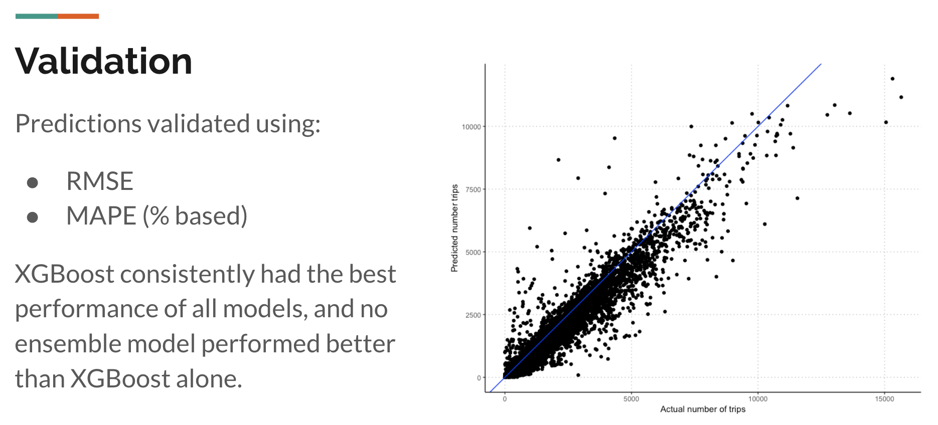
The machine learning model was trained on 2013-2017 data from actual Citi Bike stations, and validated using 2018 data from actual Citi Bike stations. I used various ML models, such as negative binomial, quasipoisson, random forests, and XGBoost, and XGBoost had the best performance of all models (ensembling showed no improvement). The final model chosen achieved a Mean Absolute Percentage Error (MAPE) of 48%, with an RMSE of ~600.
Part 2: Interactive Web Application
To make these predictions more accessible to the general public, I decided to build an R Shiny application to visualize all the data and predictions in the machine learning model. This was challenging as I had to learn how to use several new packages, such as leaflet, shiny, and sf.
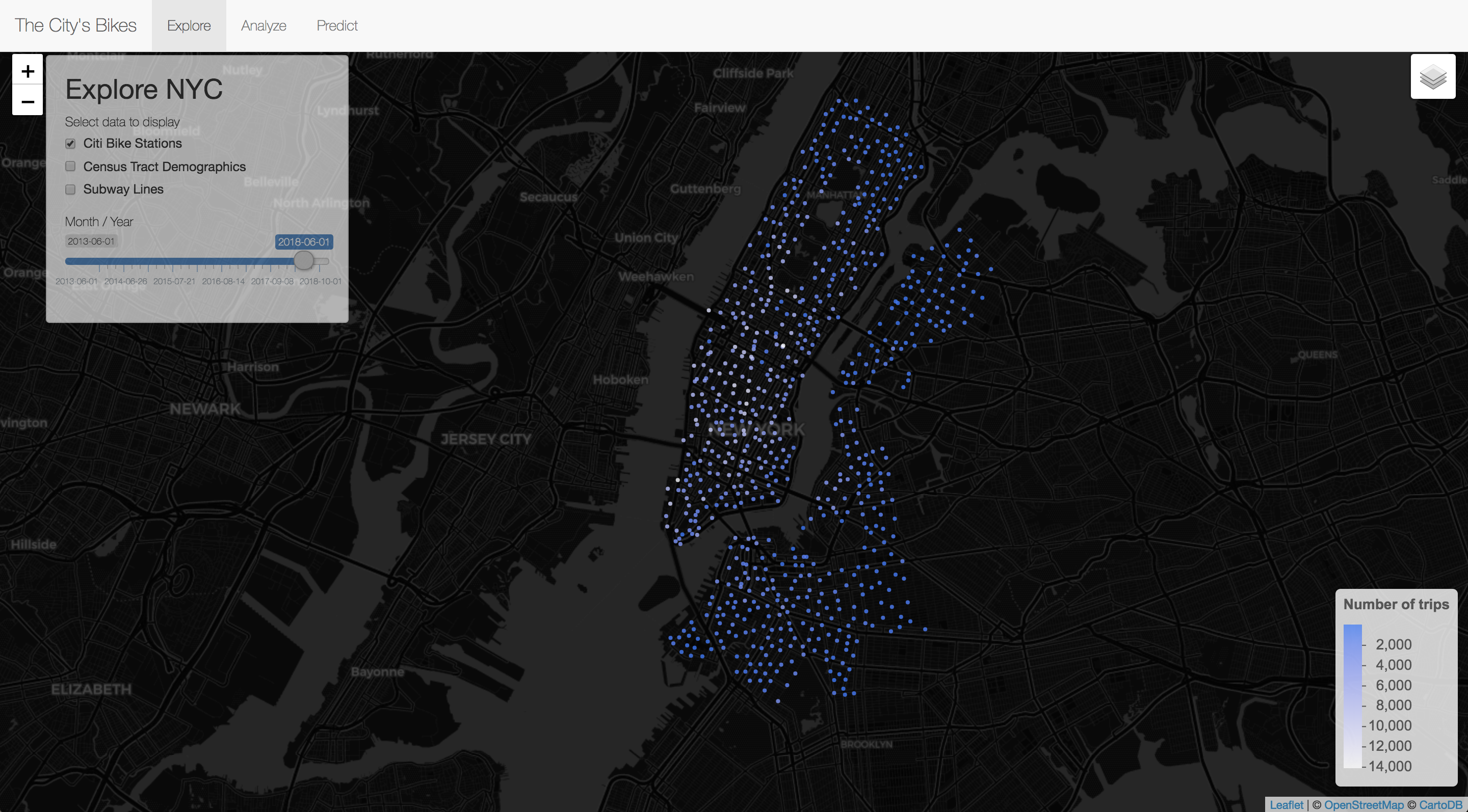
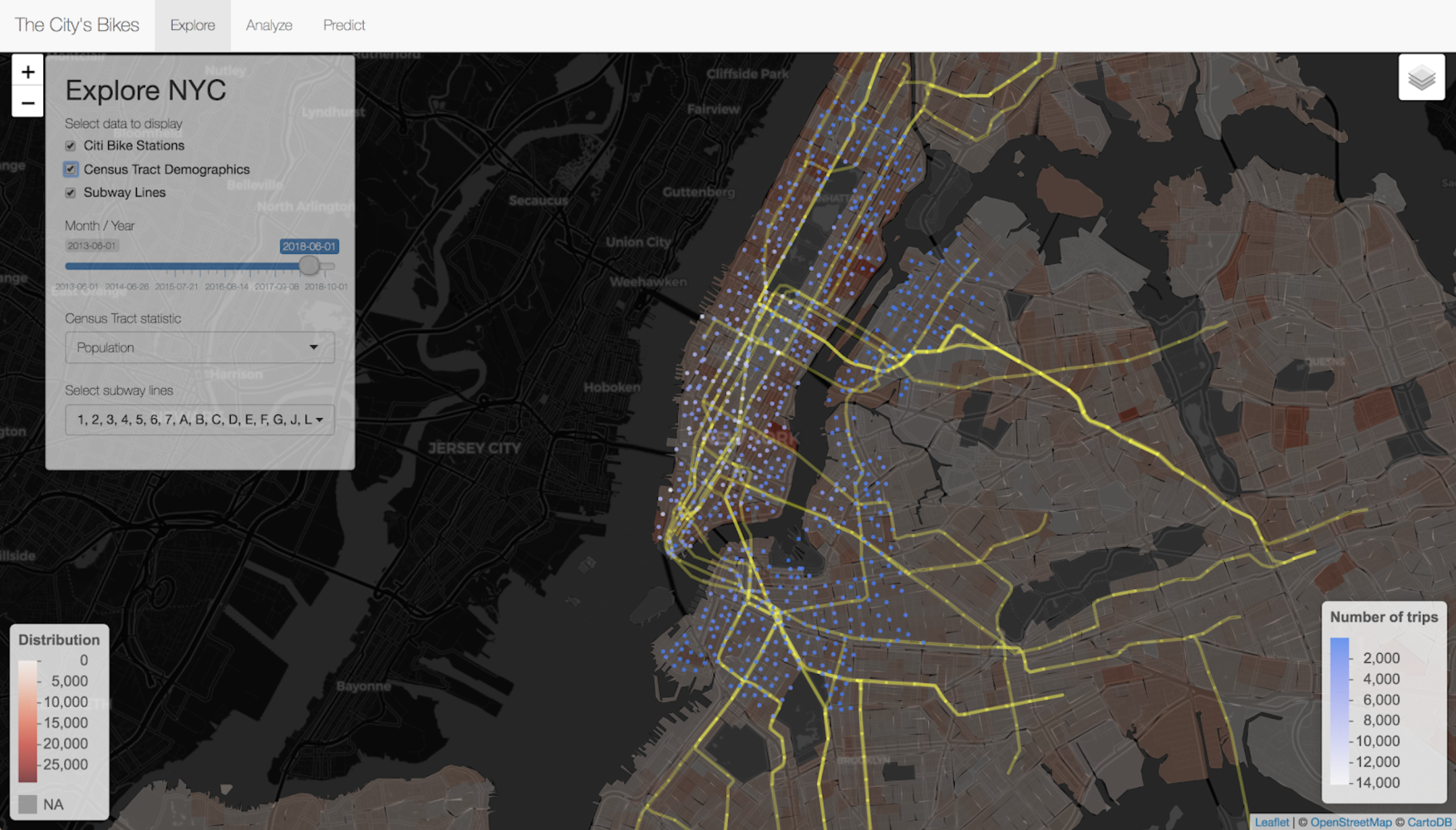
In the Shiny app, three user interfaces are provided. In the first tab, ‘Explore’, the app visualizes data on Citi Bike stations, census tract demographics, and subway lines on the same Leaflet map. This enables users to get an intuitive understanding of the geospatial variables that are incorporated into the machine learning model, and to have a good overview of the public transportation options in New York City.
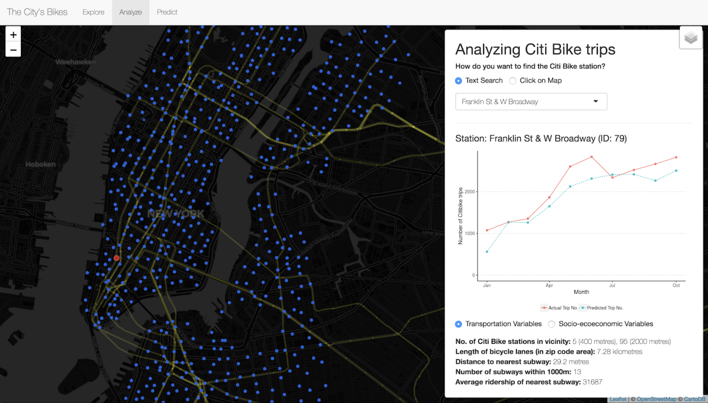
In the second tab, ‘Analyze’, the app visualizes the machine learning model’s performance by plotting the predicted trip numbers against the actual trip numbers for each Citi Bike station. Users can pick which Citi Bike station to examine, either by clicking it directly on the Leaflet map or by searching the station’s name. Some additional information about the Citi Bike stations are also provided, such as the length of bicycle lanes in the zip code area or the median household income of the census tract.
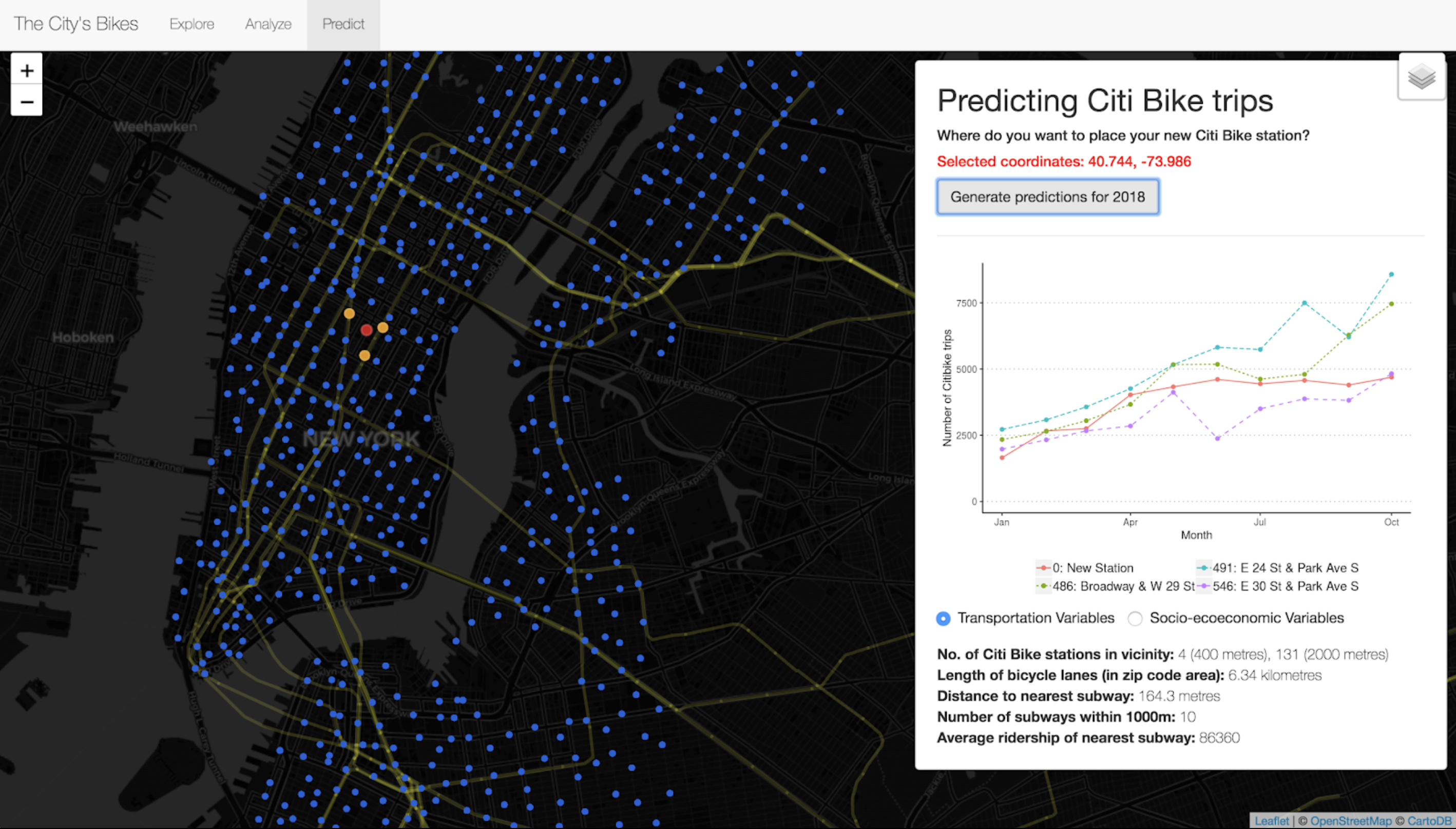
In the third tab, ‘Predict’, the app allows users to create a hypothetical Citi Bike station and see predictions for how that station would perform. Specifically, users can click anywhere on the map to set up their station, and the app generates a plot with the predicted trip numbers of the hypothetical Citi Bike station for January to October 2018. The plot also displays the actual trip numbers of the nearest three stations to the hypothetical station, which can be helpful in providing some reference point for the predicted numbers.
You can find (and play around with) my Shiny app available online at https://shaunkhoo.shinyapps.io/citibikes/.
You can find my presentation here.