Photo by Zac Ong.
Intermodality and the City
Introduction
This was my submission for the final project in my course PLAN 6106 Urban Datascapes, taught by Prof. Leah Meisterlin at Columbia University’s Graduate School of Architecture, Planning and Preservation (GSAPP). The course focused on critically evaluating the production and representation of urban data, with specific areas of interest such as transportation, housing, and crime.
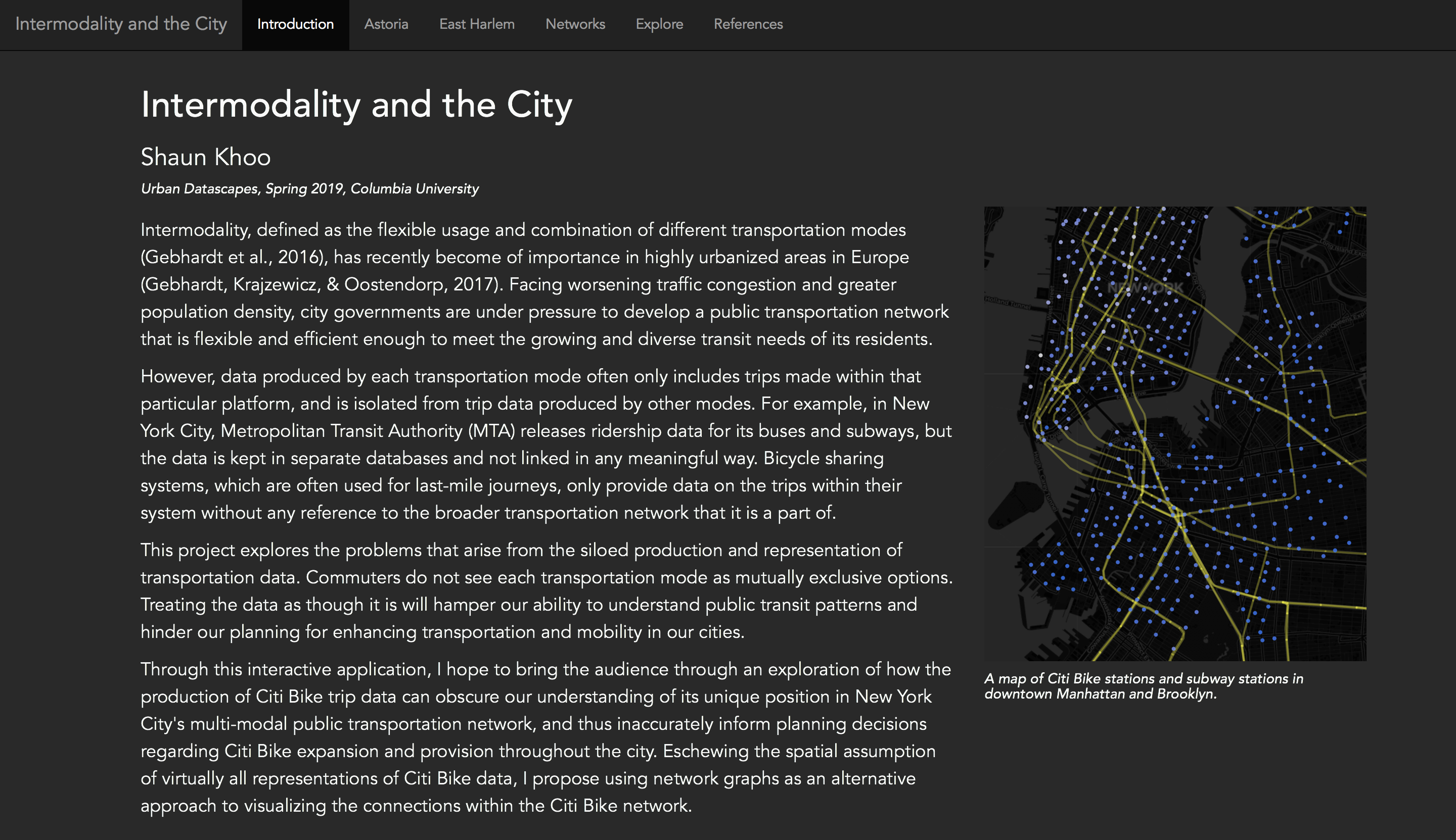
For the final project, our task was to find a dataset relevant to the topics covered in the course and to critically assess the production processes of that data. Unsurprisingly, I chose to work with Citi Bike trip data, having already used it several times for other projects. Specifically, I sought to explore how the lack of integration of transportation data across various modes of public transportation (subways, buses, bicycle sharing, taxis) would hinder a deeper understanding of the complex commuting patterns of New York City residents. My final product was an interactive web application, created using R Shiny, which brought the audience through a step-by-step exploration of Citi Bike and subway ridership data.
The Shiny app is available online here. Read on if you want to find out more about my motivations behind this project.
Case Studies: Astoria and East Harlem
I chose to examine Astoria, a neighbourhood in Queens, for the first case study as it had a significant number of Citi Bike stations in the area but only one subway line serving the area (both the N and W lines run on the same track). It also helped that Astoria is relatively wealthier than other neighbourhoods which were deeper into Queens, which has consistently been a strong predictor of Citi Bike usage.
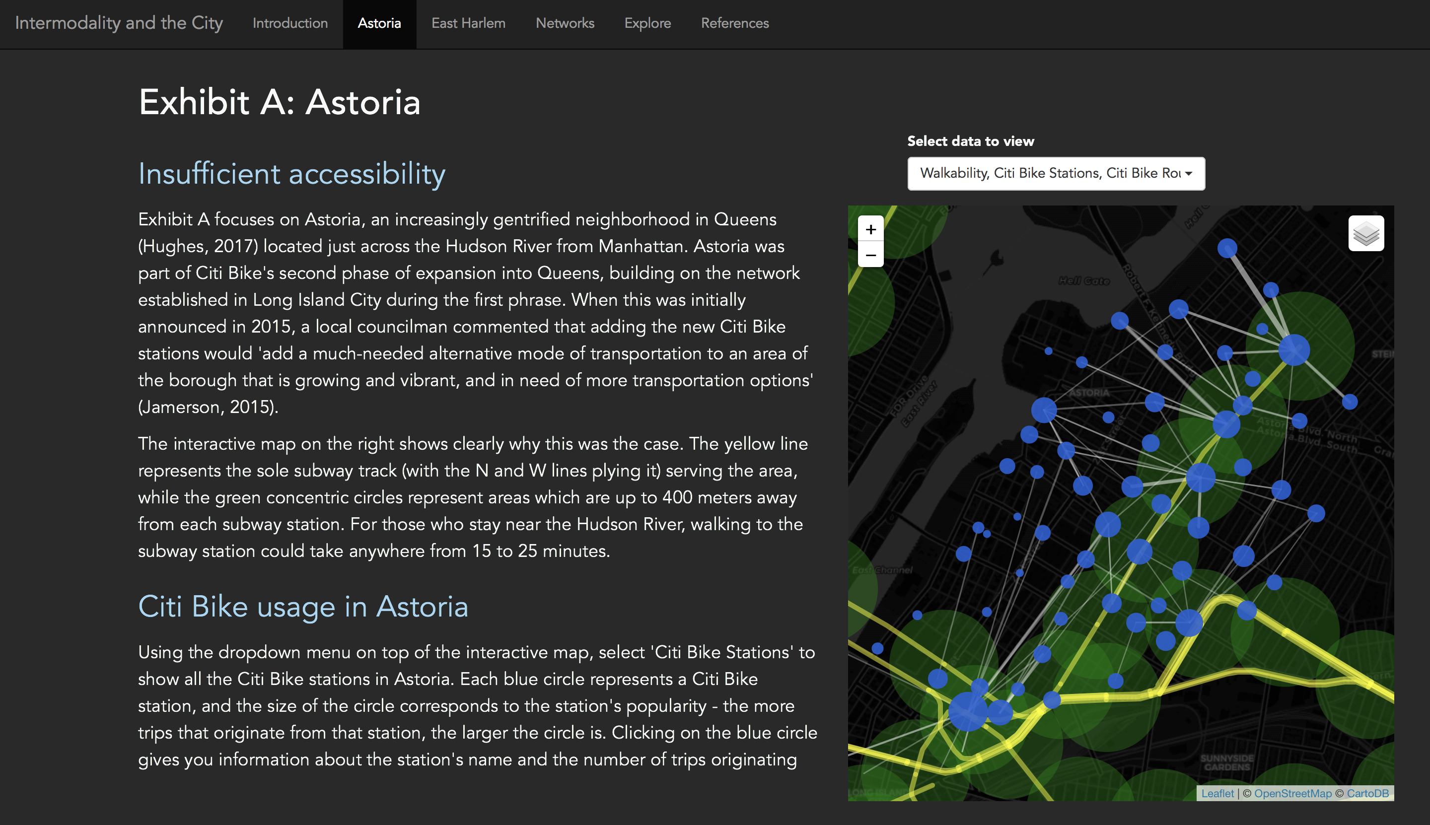
On the Shiny app, users are brought through a step-by-step process as they explore how Citi Bike trips are used as last-mile trips in the neighbourhood, especially when the destinations are beyond a 5 minute walk from the nearest subway station. Surprisingly, there were many trips made that ran parallel to the N and W subway line from the Queens Plaza subway station, which suggests that some commuters opted to bypass changing subway lines completely in favour of cycling home.
On the other hand, East Harlem is generally well-connected to the subway network, with three lines serving the neighbourhood. The neighbourhood was selected to highlight a very intriguing use of Citi Bikes to overcome a lesser-known constraint with New York’s subway system. I won’t explain further here - check out the app if you want to find out more!
Visualising Citi Bike trips as networks
Pushing beyond the usual spatial representations of transportation data, I decided to visualise commutes via a network graph instead. This had two benefits: one could immediately identify the most central nodes in the public transportation network, and patterns of usage were clearer as one could directly observe these network clusters.
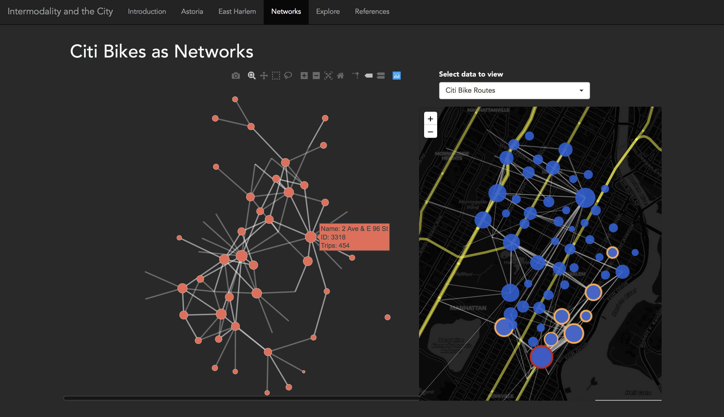
In the screenshot above, I visualised the network of trips between Citi Bike stations in East Harlem. Hovering over the nodes in the network graph would highlight the respective stations on the interactive spatial map on the right, allowing users to get a better understanding of how these stations relate to each other both spatially and in how they were used.
Conclusions
Intermodality in public transportation cannot be fully accounted for when transportation data is segregated from each other. There are important complexities to consider when designing an integrated public transportation network, and this project highlights the pitfalls of producing and representing transportation data without first combining it across different modes.