Photo by Shawn Ang.
Bus Ridership Amidst Covid-19
Introduction
We’ve come to a point where Covid-19 no longer needs an introduction. Over the past few months, cities have emptied out as governments desperately tried to stem the spread of the virus through lockdowns of varying degrees. Some have returned to a modicum of normalcy through restrictions such as compulsory mask-wearing, limited gatherings, and social distancing requirements.
Singapore is no exception to this. From 7 April 2020 to 1 June 2020, we went through a partial lockdown - called the ‘circuit breaker’, during which all non-essential businesses were closed and no social gatherings were permitted. The two subsequent phases of reopening eased these restrictions slightly, allowing socially-distanced dining in F&B establishments as well as social gatherings of up to 5 people.
Photo by Jeremy Long
During such unprecedented times, journalists and photographers began documenting how empty Singapore had become - practically a ghost town in some areas. However, I wanted a broader - and more data-driven - understanding of how urban mobility had changed since the start of the pandemic, not just that of tourist attractions and local haunts.
However, as with many things, good data is hard to come by. Google released the Community Mobility Reports to help people understand movement trends in specific cities across time, and Apple also released some mobility data (measured by the number of routing requests) for various cities. The catch here is that the data is aggregated on a city-level, and is not granular enough to enable more insightful analysis of urban mobility patterns during Covid-19.
Photo by chuttersnap
In this article, I use bus ridership numbers as a proxy for urban mobility, and analyse how Singapore’s mobility trends have changed across time since the start of the year. Since the majority of Singaporeans rely on public transportation, and buses are more accessible than trains, bus ridership numbers can be a useful proxy for understanding mobility trends on a more granular level.
In the next section, I’ll talk a bit more about the data used in this analysis. There are a fair number of assumptions that are worth understanding because they affect the analysis, so I recommend going through it first. If not, click here to go straight to the analysis. My code is available on GitHub here.
Data
Working with publicly available data is always tough because it rarely comes in the granularity and frequency that you need for the most robust analyses. Citi Bike trip data and TLC trip record data are both ideal datasets because they provides detailed (and anonymised) data for each bicycle or taxi trip. The benefit of this is that the wider community can jump in and analyse the data in ways that city planners would not have thought of - the example that comes to my mind immediately is Todd Schneider’s excellent take on whether it’s faster to cycle or take a taxi in Manhattan.
As such, it’s vital to think carefully about the data and its limitations before jumping into any kind of analysis. For this article, I used three datasets:
- Passenger volume by bus stop (January 2020 - July 2020)
- Bus stops information
- URA Master Plan 2019 Planning Area Boundary Shapefile
The first two datasets were obtained from LTA Datamall while the third dataset was retrieved from Data.gov.sg. Note that LTA Datamall only provides the past 3 months of passenger volume data - I have the data from January because I’ve been downloading the data every few months. You can download the data since January here - I’ve also included several other datasets that I’ve been collecting.
Passenger volume by bus stop
This dataset provides the passenger tap-in and tap-out volume for each bus stop, broken down by whether it’s a weekday or a weekend/holiday, and by hour of the day. While the dataset doesn’t break it down by day, the breakdown by hour is especially helpful for understanding intra-day trends.
There are several limitations with this dataset to keep in mind:
- The total number of tap-ins should match the total number of tap-outs, but it doesn’t. Strangely, in some cases the number of tap-outs exceed the number of tap-ins, when it should be the opposite (since people are more likely to forget to tap-out than tap-in). As such, the numbers won’t be perfectly accurate.
- Since the data measures only tap-ins and tap-outs, it doesn’t distinguish between someone tapping out to go home, or tapping out to transfer to a different bus service. As such, the total number of tap-ins is likely to overstate the true number of commutes that are being taken, and the total number of tap-outs will also overstate the number of people actually headed to the area around the bus stop.
- The data only provides tap-ins and tap-outs at a specific bus stop, but it’s far more useful to know where exactly their trips began or ended at. We do actually have this data, but see the side note for why it wasn’t ultimately used.
- Bus trips are an imperfect proxy for the actual levels and trends of mobility. There are many alternatives available for the same trip: one can walk, take a taxi or private hire vehicle, or drive. This is especially the case during Covid-19 when people may prefer avoiding public transportation.
- Bus trips are also a biased proxy: buses may be the most convenient for some areas, but in others bus stops may be very sparse (think HDB flats vs landed properties). Generally, bus trips as a proxy would perform better in neighbourhoods with many bus stops than those without. It’s worth noting that this bias is more damaging to the analysis than it being an imperfect proxy, since the effect is not consistent across groups in the data.
In the end, we work with what we have. This dataset is the most granular and thorough that is publicly available, and our high public transportation utilisation rates means that bus trips aren’t as bad a proxy as they are for cities like New York or San Francisco. In the analysis below, keep all of these caveats above in mind.
Side note: I would have preferred using the origin-destination ridership data instead, but after tinkering with it for a few hours I found some errors in the data (the numbers are off by over 20x), I gave up and stuck with this instead.
Bus stops information
This is fairly straightforward. The API provides the bus stop code, road name, description, latitude, and longitude for every single bus stop in Singapore. As it turns out, we have 5043 bus stops all across the island.
URA Master Plan 2019
A KML file of the URA Master Plan 2019’s Planning Boundary is available online at Data.gov.sg, which gives you the polygons for each of the 55 Planning Areas in Singapore. After hours of tinkering, I found it difficult to import the KML into Python in an easy-to-use format, so I’ve taken the extra step of converting the KML to a GeoJSON file using QGIS which I’m more familiar with.
You’ll see that the dataset is fairly simple - each Planning Area has a name, a two-letter contraction of its name, and a region that it is assigned to. I found it quite instructive to look at the interactive map of the Planning Areas online for a bit before diving into the analysis - mostly because these Planning Areas don’t always align neatly with our conventional understanding of where these neighbourhoods are.
Side note: I was originally going to analyse origin-destination ridership data using the land use information from the URA Master Plan 2019. I’ve kept the code which integrates land use information with bus stops data in the Jupyter Notebook, but note that it’s not needed at all in the analyses for this article.
Analysis
With a proper understanding of the data, we can now dive into the analysis itself. Here are the questions I want to examine:
- What is the overall pattern of trips across January 2020 to July 2020?
- In which neighbourhoods is this pattern strongest?
- For which timings is this pattern strongest?
1. What is the overall pattern of trips across January 2020 to July 2020?
To do this, I take the node ridership data and sum the total tap-in volume across all bus stops and timings, broken down by month. Since each tap-in is associated with a bus ride, this will give us the total number of trips taken for each month.
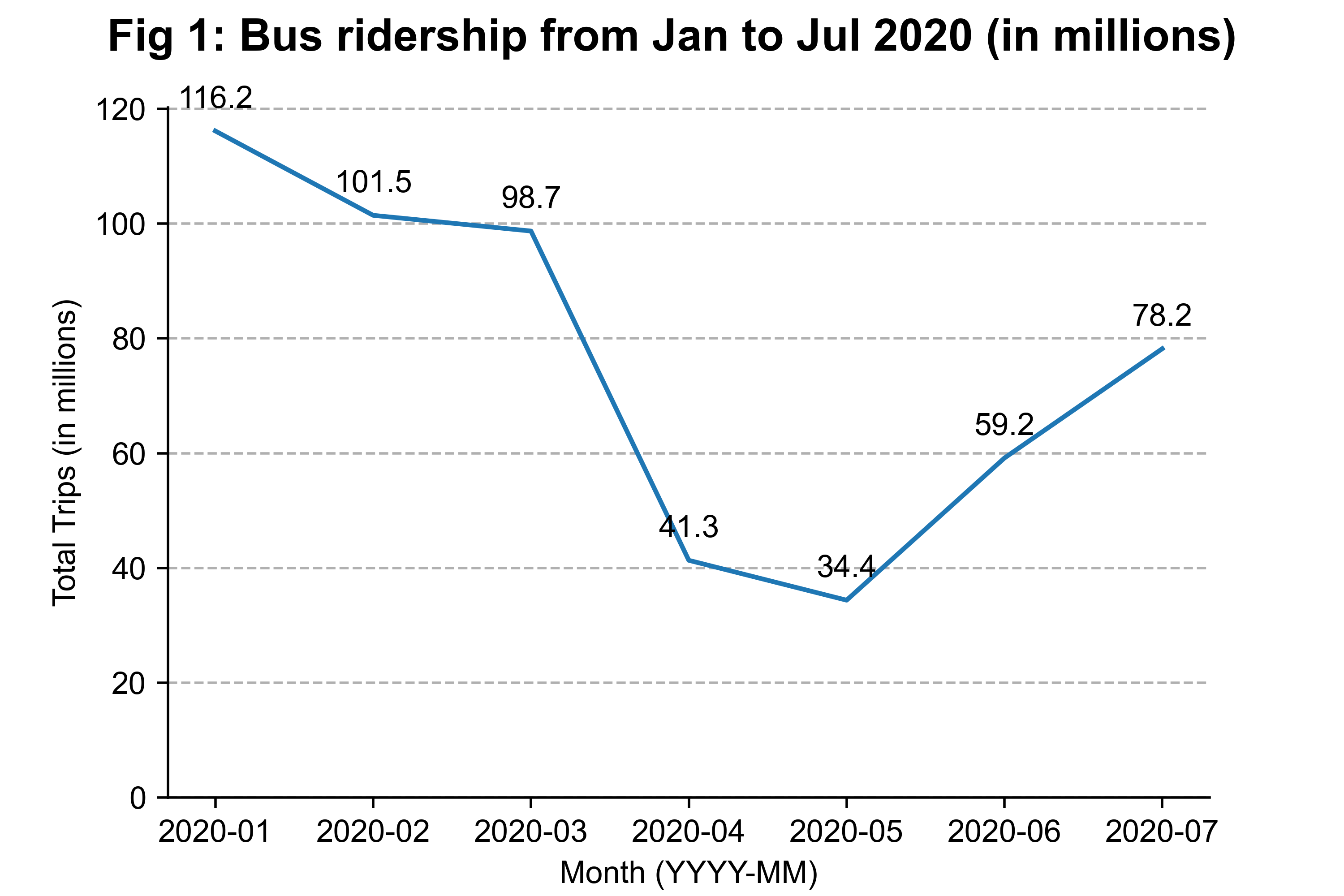
The effect of the circuit breaker is clear: bus ridership dropped by more than 60% between March and April, and slid further in May (fairly consistent with MOT’s numbers). In June, both Phase 1 (2nd June) and Phase 2 (19th June) of the reopening unsurprisingly led to a rebound in ridership numbers since people could now meet in small groups and some businesses could reopen as well.
Since the circuit breaker was in effect across April (barring the first week) and May, we can put together a rough estimate for how much ‘activity’ there was across the circuit breaker, Phase 1, and Phase 2 periods.
- In the pre-pandemic period (January), the average daily ridership was 116.2 million trips / 31 days = 3.7 million trips.
- In circuit breaker period (May), the average daily ridership was 34.4 million trips / 31 days = 1.1 million trips.
- In Phase 2 (July), the average daily ridership was 78.2 million / 31 days = 2.5 million trips
Putting this information together, we get:
- Circuit breaker ridership was 30% of pre-pandemic numbers.
- Assuming Phase 2 ridership was consistent across June and July, then the Phase 1 average daily ridership would be [59.2 million - (12 days * 2.5 million trips/day)] / 17 days = 1.7 million trips, which is 46% of pre-pandemic ridership.
- Phase 2 ridership was substantially higher but still only around 68% of pre-pandemic levels.
The numbers appear sensible to me, since Phase 1 allowed students to head back to schools and manufacturing companies to resume work, and Phase 2 allowed dining-in for F&B establishments as well as social gatherings of up to 5 people. There are some problems with this back-of-the-envelope calculation - for example, Phase 2 in July probably had more ridership on average than Phase 2 in June - but it gives us a broad idea of how much more ‘activity’ we had when moving out of the circuit breaker. Notably, MOT recently announced that train and bus ridership fell to 25% during the circuit breaker and 60% in Phase 2, which are pretty close to the estimates we have above.
Generally, ridership numbers collapsed in April and May, but have been recovering since then. We haven’t returned to pre-pandemic ridership numbers yet, and probably won’t even in August. Either way, it would be interesting to see how significant the increase is when August’s numbers are released.
2. In which neighbourhoods is this pattern strongest?
Now that we’ve looked at the overall trend, we can start slicing the data from different angles. As I’ve explained in the Data section, each bus stop is located in one of URA’s 55 Planning Areas according to their 2019 Master Plan. To understand how the impact of Covid-19 has varied from neighbourhood to neighbourhood, I aggregate the ridership numbers of bus stops by the Planning Area they are located in. Since each area is unique in terms of size and population, I normalise the ridership numbers with January 2020 being the base (or 100). I plot the lines for each Planning Area in grey, and highlighted in color the top 3 and bottom 3 Planning Areas in terms of the relative changes in ridership.
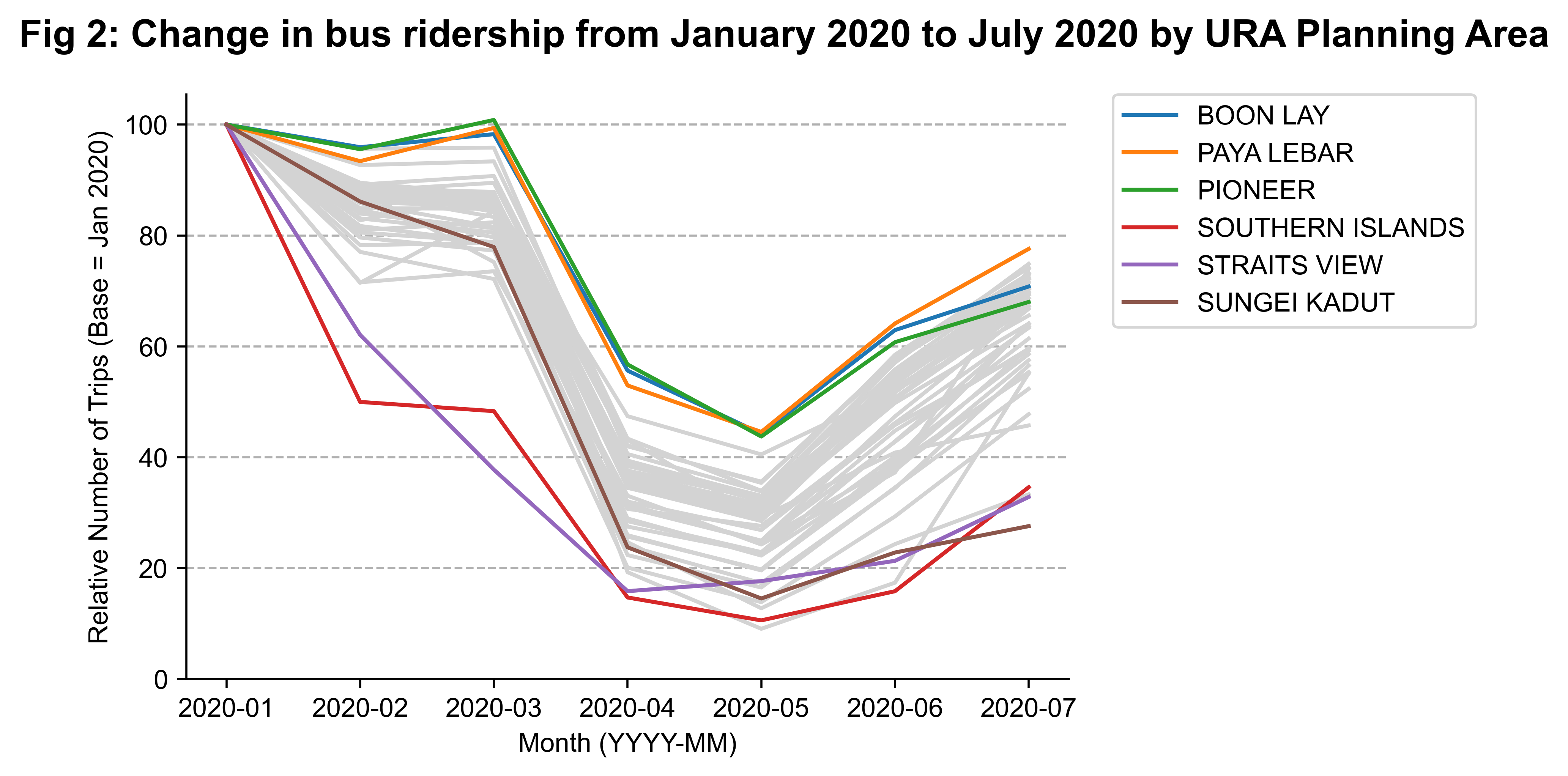
The general shape of the grey lines matches pretty well with what we saw in Figure 1, but we can see considerable variance in the relative drop in ridership numbers across the different neighbourhoods. In April, Pioneer and Boon Lay are at around 55% of their January 2020 numbers, while for Straits View and Sungei Kadut the number is 15%. Let’s take a deeper look at the top and bottom 3 Planning Areas by the relative change in bus ridership first.
Looking at the bottom 3, both the Southern Islands and Straits View Planning Areas encompass Sentosa and Marina South Pier, which are tourist and travel hotspots. Below are interactive satellite maps (try zooming in and out!) with the markers indicating the bus stops and the blue shaded region indicating the Planning Area, with Southern Islands on the left and Straits View on the right. Hovering over the markers gives you some information about the bus stop.
In February, the spread of Covid-19 on the Diamond Princess cruise liner most likely scared off all potential holidaygoers, while the worsening pandemic in Italy and Germany probably dampened tourist numbers. Singapore started closing her borders to foreign visitors in end-February, but Singaporeans (and tourists from other countries like the UK and USA) could still visit Sentosa in March when case numbers were still low. Of course, the numbers finally dropped all the way in April with the commencement of the circuit breaker, and have not really recovered since.
Sungei Kadut stands out in particular because it was middling along in February and March before a precipitous drop in April, with a very slow increase since May. Sungei Kadut is just north of Choa Chu Kang, and is the industrial estate which surrounds the Kranji MRT station.
As Business 2 companies, most of them are in the manufacturing sector which should have reopened in Phase 1 according to this advisory by MOH and this list by MTI. My best guess is that such industries are more reliant on migrant workers, who were quarantined and tested during the circuit breaker in response to a spike in Covid-19 cases in purpose-built dormitories for migrant workers in early April. The Movement Control Order (MCO) imposed by Malaysia also stopped workers in nearby Johor from commuting to Singapore for work, which is a big blow considering an estimated 200,000 to 250,000 Malaysians enter Singapore daily to work in manufacturing and other sectors. Without enough workers, some businesses may not be able to restart work, thus contributing to less activity within the Sungei Kadut area.
How about the top 3 then? Pioneer and Boon Lay are adjacent to each other and comprise mostly factories and other industrial businesses - note that these Planning Areas don’t correspond to the residential neighbourhoods called Pioneer and Boon Lay .
Why have they suffered the least from the circuit breaker measures, even as largely industrial areas? My hunch is that both areas serve the needs of the maritime sector in Singapore, which was mostly exempted from the suspension. If you hover over the bus stops in the southern area of Boon Lay, you’ll see many of them reference shipyards or offshore refining. Similarly, there are many large docks visible in the southern areas of Pioneer, and Keppel shipyard is also mentioned in some of the bus stops too.
Not all businesses in these two Planning Areas are related to the maritime sector, but it is plausible that enough of them are, and this helped to cushion the fall in ridership across April and May.
Most of the area in the Paya Lebar Planning Area is taken up by the Paya Lebar Air Base, but we can also see some industrial areas at the bottom left and top right corners. ST Engineering Aerospace is located in that bottom left corner, and is almost certainly one of the aerospace maintenance, repair, overhaul (MRO) companies that were exempted from the circuit breaker closures. At the top right corner is the Tampines Wafer Fabrication Park, which was probably not as adversely affected by the quarantining of migrant workers as other industries that are more labour intensive.
To give a better overview of how the circuit breaker affected Singapore across each Planning Area, I generate an interactive choropleth map by colouring each area by their relative ridership in May 2020. The darker the shade of blue, the higher their relative ridership is (ie they are not as adversely affected by the circuit breaker). You can hover over each area to get the Planning Area’s name and the actual normalised ridership number for that area.
None of the most and least affected Planning Areas were residential, and from this chart we can observe that most neighbourhoods registered around 25-35% of their Jan 2020 ridership during the circuit breaker. The effect appears to be fairly consistent across residential towns, although there are some oddities in the numbers, such as Queenstown at 24.8% and Bukit Merah at 32.5%, or Woodlands at 26.9% and Sembawang at 35.4% - I would have expected adjacent neighbourhoods to have smaller differences.
The downtown area in Singapore was also hit pretty badly, with Orchard, Newton, Museum, Downtown Core, and Marina South all down to one-fifth of their original ridership numbers. This is unsurprising since work-from-home arrangements were mandatory for all non-essential businesses across April to May.
Generally, the circuit breaker was most keenly felt by areas dependent on tourism and office workers. Compulsory work-from-home arrangements, coupled with having no residents in the vicinity, predictably led to a virtual standstill in terms of human traffic around these central areas. In contrast, industrial areas home to essential businesses in the maritime or aerospace sectors were never hit as hard, and have subsequently recovered faster as well.
3. For which timings is this pattern strongest?
Instead of analysing the data from where the bus stops are located at, how about looking at the distribution of ridership numbers across different hours of the day? Below, I plot the relative bus ridership numbers (with January 2020 as the base again) across the hour of day, with each month coloured according to the legend. I also split the data into weekdays and weekends/holidays to tease out how much of a difference the work-from-home arrangement has made.
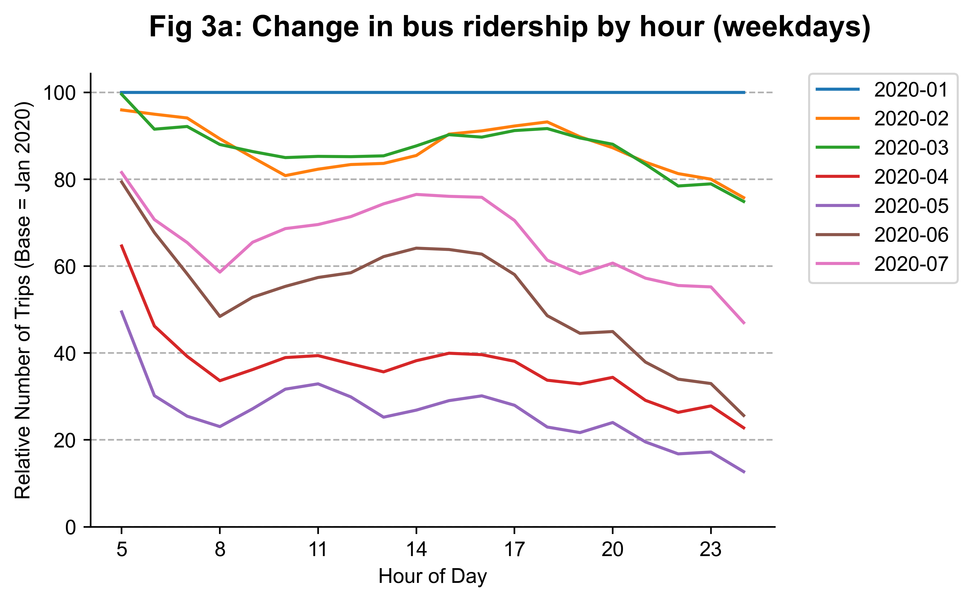
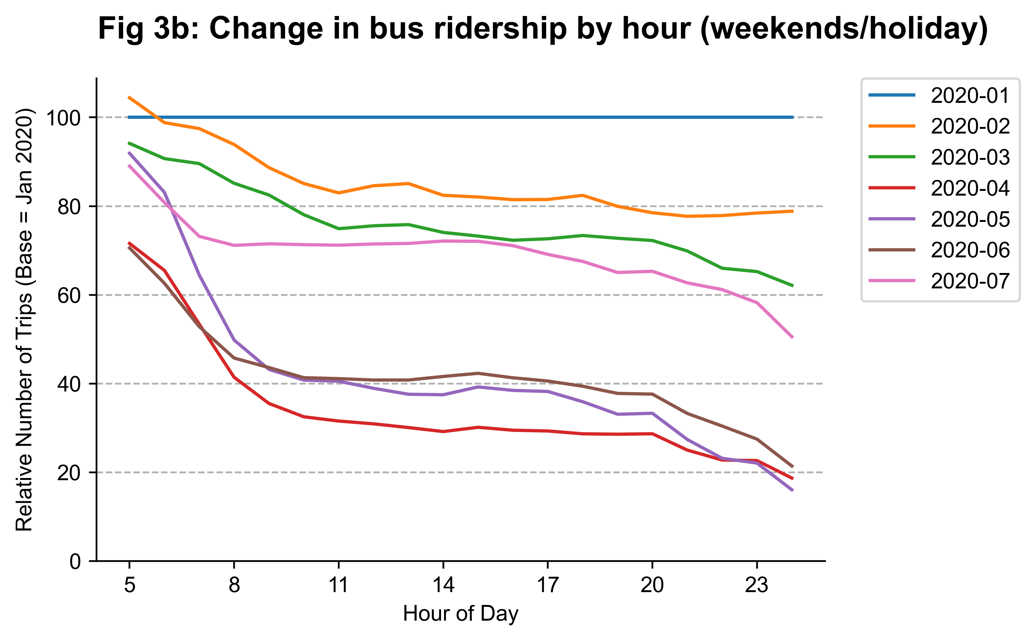
The general position of the lines is consistent with the earlier charts: April and May had it worst, with a pretty good recovery in June and July. The interesting bits here are in the specific shapes of the line - a line that bends downwards indicates a greater relative shortfall in ridership. There are a few interesting trends that stand out to me:
- Across all months, the first hour has the smallest relative change while the last hour has the largest. Those travelling at 5am are probably those who need to get to work early, and tend to be blue-collar workers in essential industries during the circuit breaker period.
- Morning and evening peak hour traffic have dropped significantly. Public transport ridership spikes around these timings as office workers are heading in or out of the CBD area. Work-from-home arrangements have obviated that need, so this is not surprising.
- Fewer people are staying out past 8pm, even in Phase 2. Alcohol consumption is not allowed after 10.30pm even in restaurants and bars, while pubs and nightclubs remain closed even in August.
- Significantly more people went out over the weekends in July than in June - the numbers are just a whisker away from March’s weekend numbers. Fatigue over the restrictions is one possible reason, especially after 2 months of having no social gatherings. I can’t be sure of actual numbers, but there were news reports of crowded beaches over a weekend in late July.
Both charts point to the impact of two measures that the government has not relented in: work-from-home arrangements and keeping nightclubs closed. Even in July, peak hour ridership has only returned to 60% of pre-pandemic levels, in contrast to off-peak afternoon numbers which are at 75%. Night ridership is the slowest to recover, a consequence of the limited late-night options available. While effective, it’s worth remembering that these measures are very costly to businesses in the CBD area that rely on foot traffic, and to pubs and nightclubs that are perilously close to closing down.
Conclusion
I wrote this article with the objective of putting some numbers around how significantly mobility was affected by the various movement restrictions to stem the spread of Covid-19. Although the general trends were not surprising, there were some interesting discoveries - the contrast between Sungei Kadut and Pioneer/Boon Lay is one, and the jump in weekend ridership in July is another. Such insights aren’t as immediately obvious as other trends (like the CBD emptying out), and helped me to better appreciate the nuanced impact of the circuit breaker measures.
As is customary, here is a list of things I would have liked to do if I had more time or data. Feel free to take any of these up if you’re interested!
- Make the analysis even more granular by using origin-destination bus ridership data to see what kind of trips have suffered the most (trips from residential areas to shopping malls?). This isn’t possible until the data is fixed though.
- Repeat the analysis for MRT trips, with a focus on comparing intra- to inter-neighbourhood mobility due to the different dynamics of MRT and bus trips.
- Analyse intra-day trends on a Planning Area level to tease out differences between the different residential neighbourhoods, since we noted a 25%-35% range.
- Validate the hypothesis about the difference between Sungei Kadut and Pioneer/Boon Lay being due to the presence of the maritime sector in the latter.
- Assess how imperfect and biased buses are as a proxy for mobility by comparing it with other measures of urban mobility.